Building Depth
CORE IDEA
Depth Is Revealed, Not Added
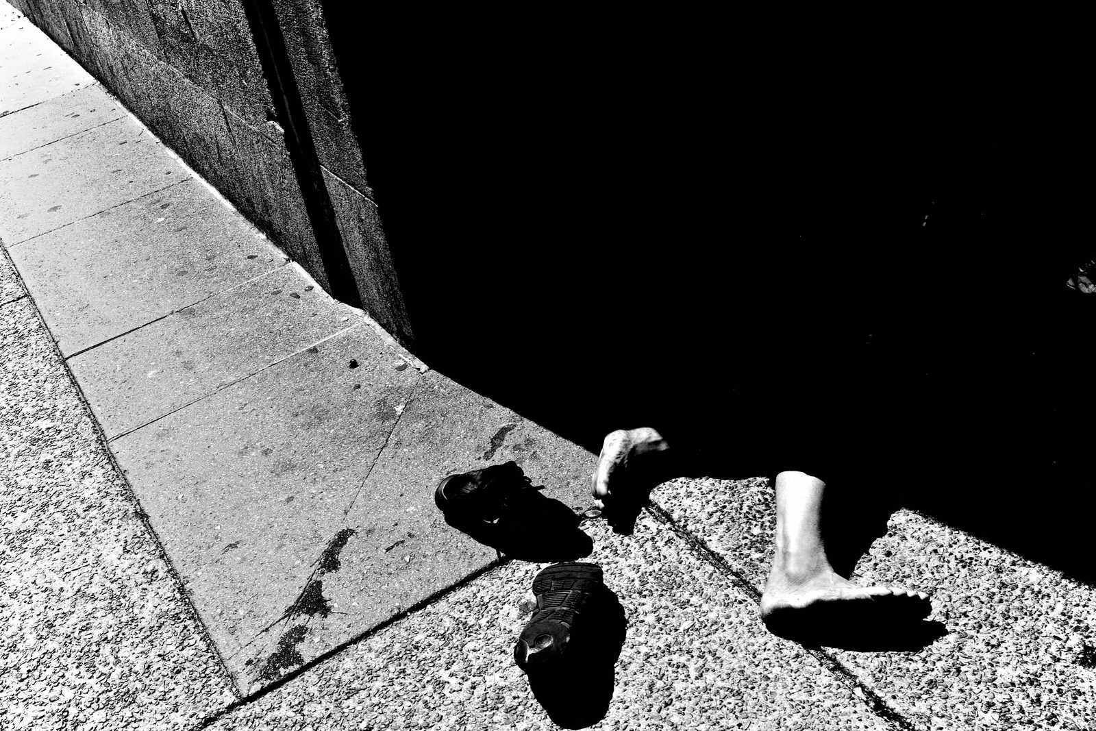
What's popping, people — it's Dante. Today we're building depth — and here's the line I want you to carry the whole lesson: depth is not something you add to a photograph. It's something you reveal. The space is already there in front of you. Your job is to separate the planes so the eye can finally feel it.
LEARNING OBJECTIVE
What You'll Be Able to Do

By the end of this lesson you'll be able to take a flat-looking street and pull it into distinct planes — foreground, middle ground, background — using overlap, scale, leading lines, and light. You'll stop making images people look at and start making images they step into.
WHY THIS MATTERS
Flat Frames Keep You Out
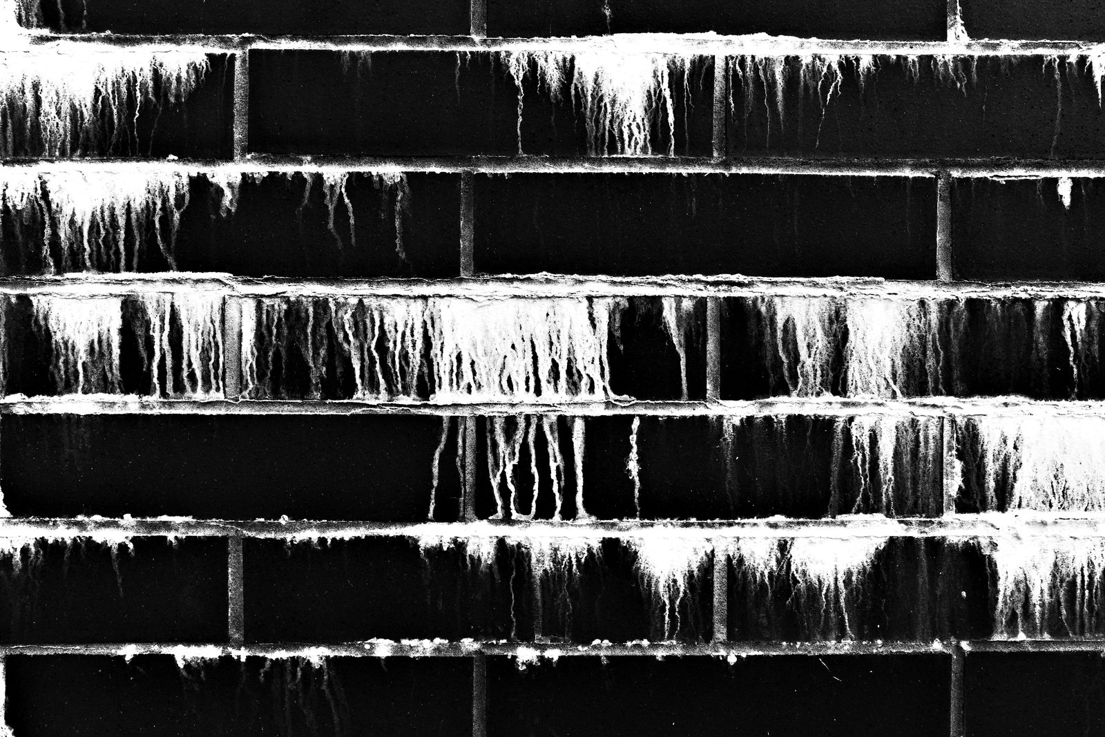
Here's why this matters. A flat frame keeps the viewer at a distance — they glance and move on. A deep frame feels immersive. It invites the viewer into the scene instead of keeping them at a distance. Depth is the difference between observing a moment and being inside one.
Depth Gives the Story Room
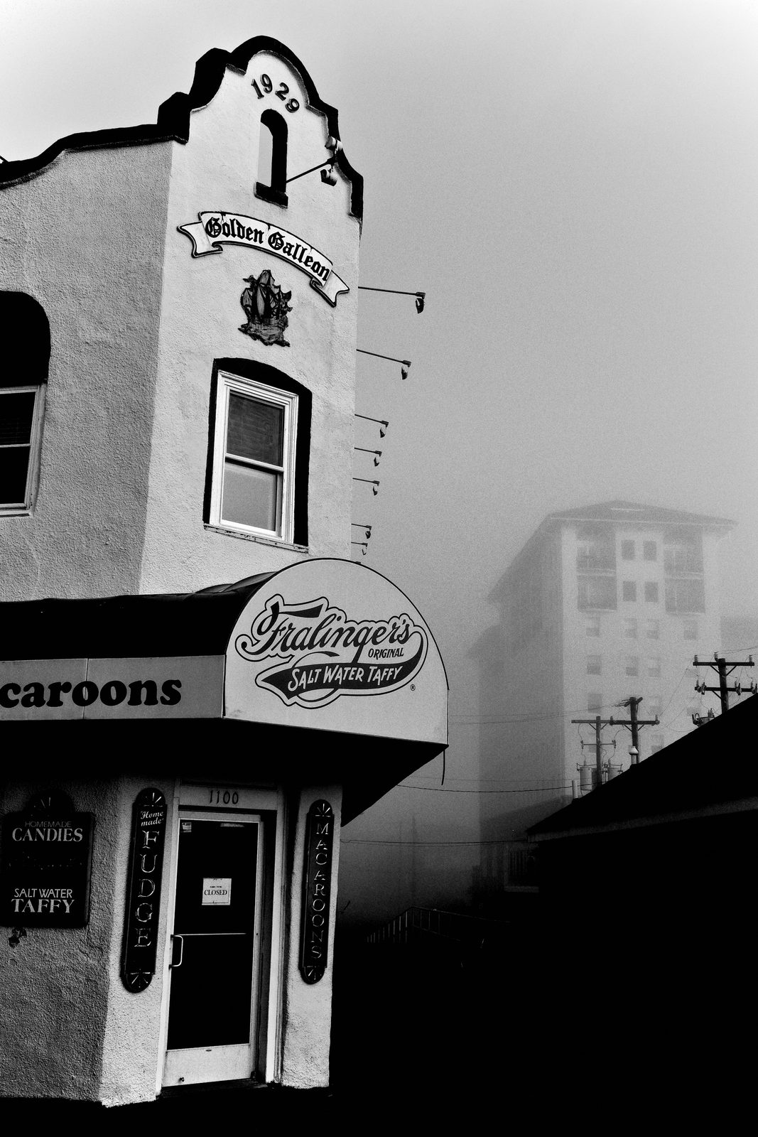
And depth isn't just visual — it's emotional. When you build real space into a frame, the story gains room to breathe. The eye travels, it discovers, it arrives. That journey from front to back is what lets the meaning of a moment actually land instead of bouncing off a flat surface.
MAIN TEACHING
Three Planes, Three Jobs

Let's get spatial. Most strong photographs live in three zones, each with one job. The background provides structure. The middle ground provides meaning. The foreground provides depth. When those three relationships align, the frame gains weight and presence. Depth is the foreground's specific contribution — that's what we're chasing today.
Depth Comes from Difference

First principle of depth: depth is not about how bright something is. It's about difference. Depth appears when light changes as it moves through space — fading, intensifying, separating one area from another. A scene with uneven light will almost always feel deeper than a scene where everything is lit the same.
Read the Light Falloff

Train yourself to read light falloff. As light moves away from its source, it weakens — and that weakening creates natural layers. Look for light fading across a wall, gradual transitions from highlight to shadow, zones where illumination just breaks off. Those subtle shifts tell the viewer how far things sit from one another. Depth is often hiding right there.
Light Separates the Planes

Light is your strongest depth tool because it does the separating for you. The right light can pull a subject forward, hold the middle ground steady, and push the background back. You don't need three people to make three planes — layered light can suggest an entire space on its own. Let the light organize the room.
Side Light and Backlight Sculpt

Direction matters. Front light flattens scenes. Side light and backlight sculpt them. When light wraps around a subject instead of hitting it straight on, it reveals edges and contours, separates the body from the background, and depth increases immediately. So when a frame feels flat, look for the angle where light grazes instead of glares.
A Light Source Builds the Planes

Think about any scene lit by a single strong source — a fire, a lamp, a shaft of sun through a doorway. The action in front of it isn't what builds the depth. It's the way the light moves through the scene. The source catches a face or a surface and pulls it forward. Wait for the light to land just enough, and the depth reveals itself: a dark foreground holding weight, a middle ground where light and shadow interplay, a background receding into darkness. One light source can carve an entire space into planes.
A Strong Foreground Anchors
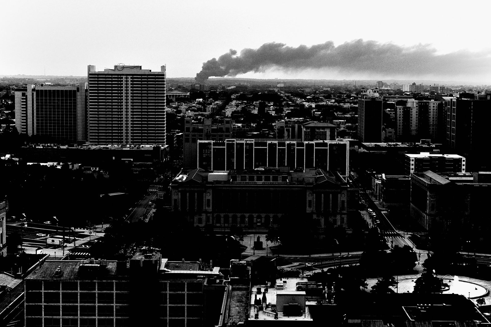
Now the foreground — your most direct depth lever. Without a foreground, the eye floats. Put one strong element close to the lens and everything changes: the viewer knows where to enter the image, depth is established instantly, and chaos gets organized. A foreground does the heavy lifting so the rest of the frame can stay simple.
The Entering Hand Changes Everything

Picture a scene that already has energy — bodies, water, light, movement. It can still keep the viewer at a distance, watching from outside. Then one near element enters the frame — a hand at the foreground edge — and everything changes. That hand creates immediate depth, pulls the viewer in, and anchors the chaos. Without it, the image is observational. With it, it becomes participatory. The difference isn't the action in the middle ground — it's the foreground.
Overlap and Scale
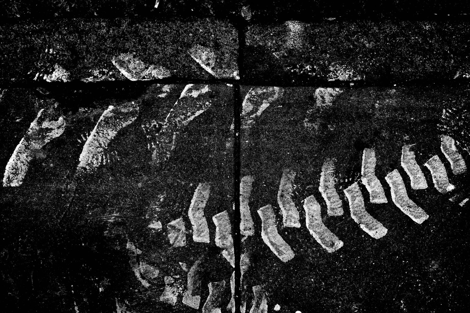
Two more depth engines: scale and overlap. Get close and that proximity adds intimacy and scale — a large near element against a smaller far one instantly reads as distance. But the layers must stay separated. A good foreground is clearly separated from the middle ground, with a distinct shape or tone. When near and far merge into one blur, the depth collapses.
Separation Makes Depth Visible
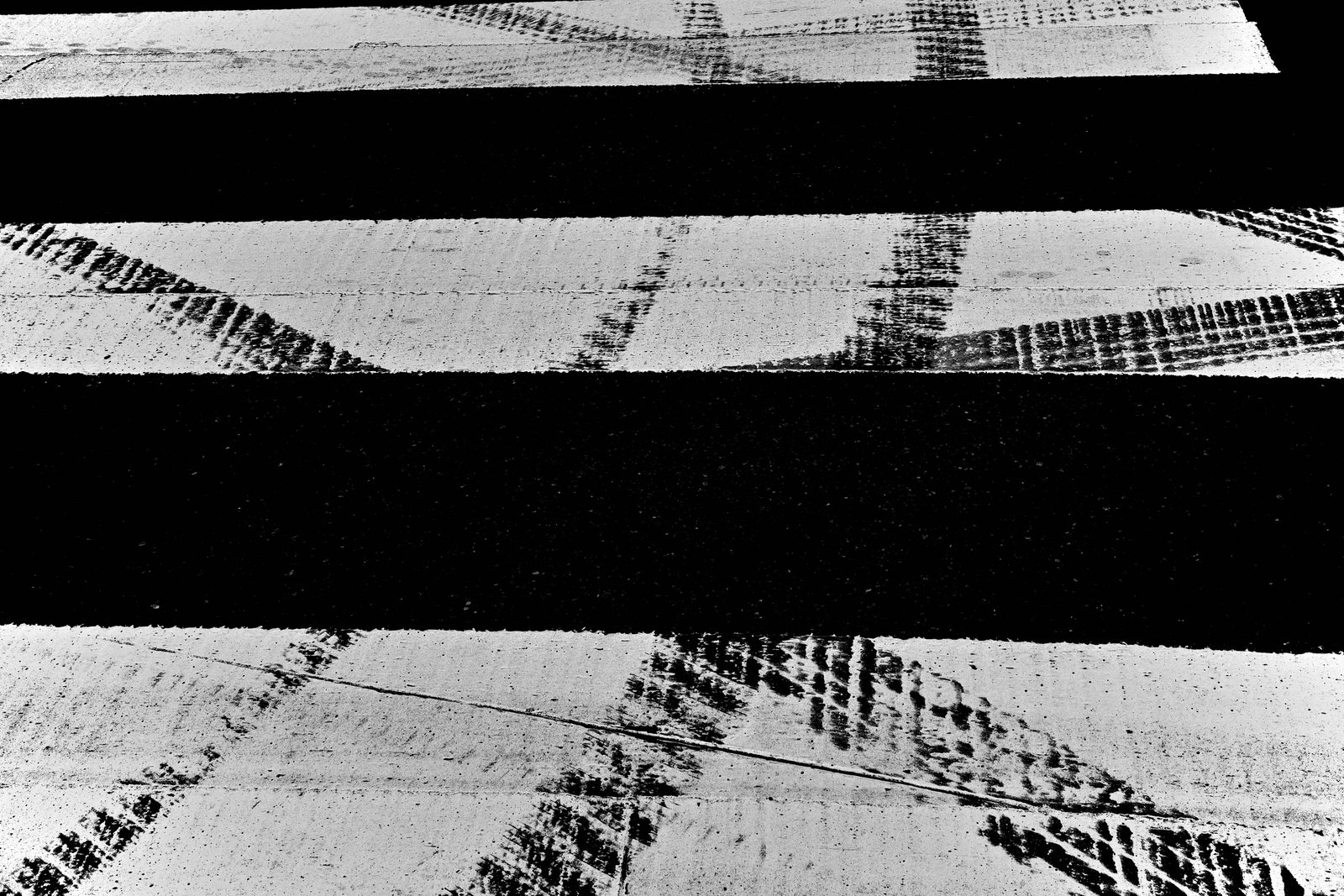
This is the hinge of the whole lesson. When a figure enters your foreground, move so the silhouette reads clean against the wall behind it — avoid letting it overlap the background. Without separation, layers turn into noise. With separation, depth becomes visible. You don't need perfect separation — just enough for the frame to be readable.
Geometry Guides the Eye Inward

Depth also lives in structure. You don't create geometry. You recognize it. A sidewalk receding into the distance, a doorway, a window cutout — these pull the eye front to back and stack the layers cleanly. A window can frame an object in the background while a figure leans in at the foreground, the opening holding each plane apart. The geometry is already built; your only job is to position yourself so the layers sit inside it.
Move Your Body to Build Depth

Never forget: depth is physical. Small movements change how the planes separate and how much they overlap. Dropping to a low angle can separate a wall, a doorway, the poles, and the sky — one position decision clarifies every layer. So when a frame feels flat, don't think longer. Move. Step in, drop low, shift left. Let the space reorganize.
Depth Without Clutter

Here's the counterintuitive part. A common mistake is trying to add more elements to create depth. Often, the opposite works better. If a frame feels busy, it's usually compensating for weak separation. Use light, scale, and one strong foreground and you can build deep frames with fewer subjects, simpler compositions, less movement. Strong light removes the need for excess.
PRACTICAL APPLICATION
The Back-to-Front Build
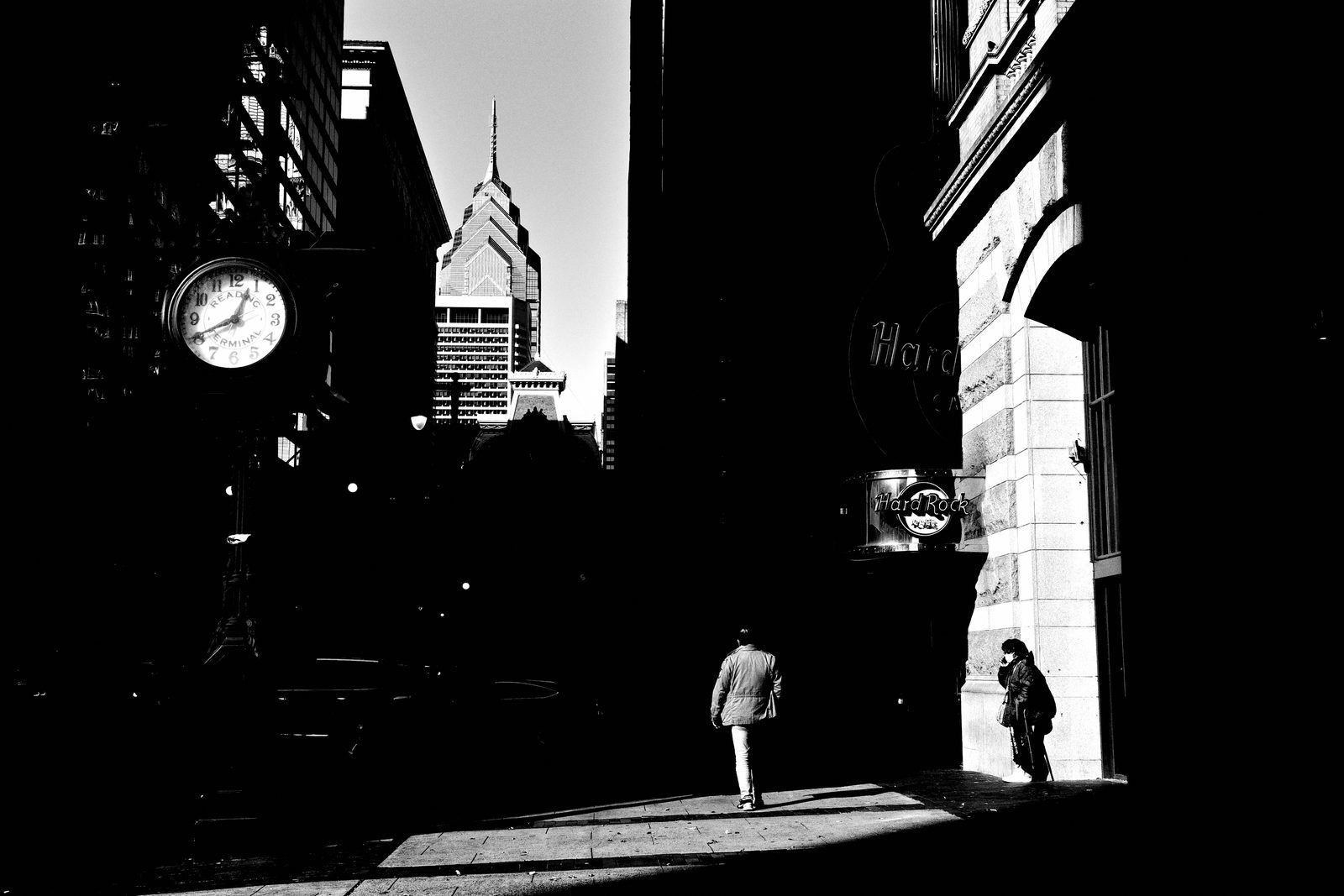
Drill one — build back to front. Find the background first — the wall, the light, the structure that works on its own. Lock your position so the planes separate. Then wait for the middle ground to enter, and add a foreground only if it adds depth. You stop reacting and start building. That's how depth gets made deliberately instead of by luck.
The One-Foreground Exercise
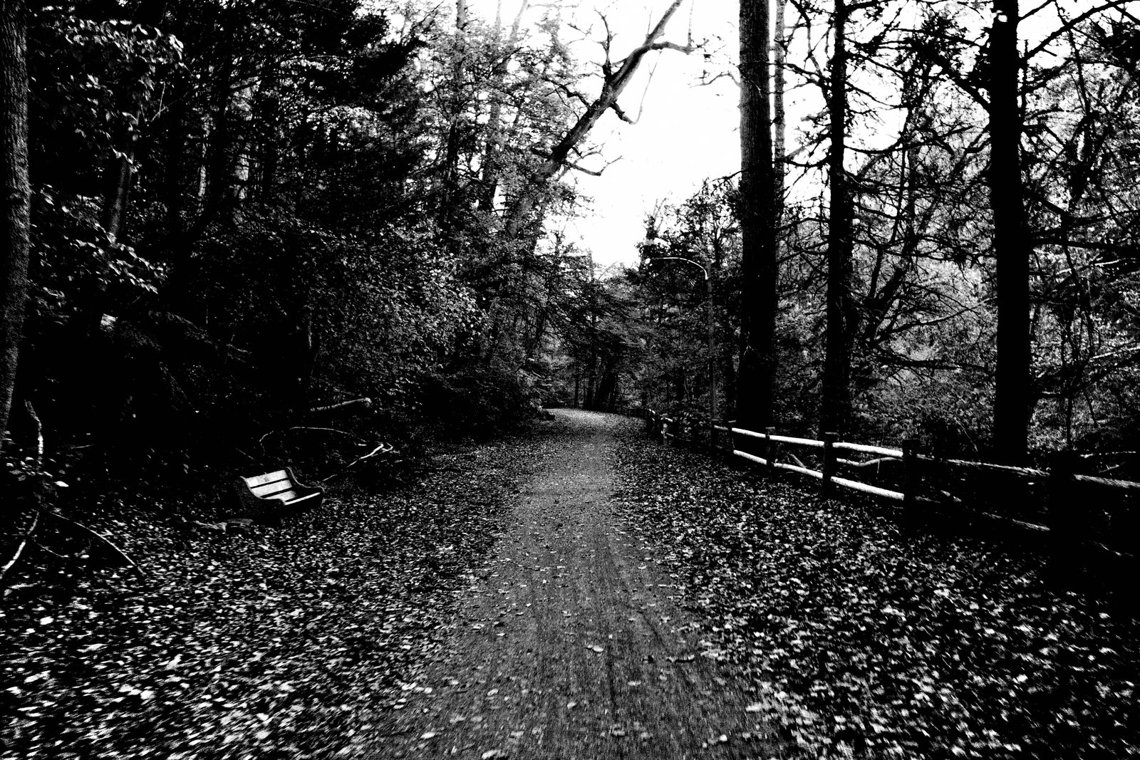
Drill two — the one-foreground exercise. Find a scene, choose one dominant near element, and commit to it. Strong foregrounds come from standing close enough, holding position, letting elements enter the frame — and not flinching when they do. One strong element beats many weak ones. Let it lead; let everything else support. That single commitment will carry the depth.
COMMON MISTAKES
Careless Foreground, Merged Layers
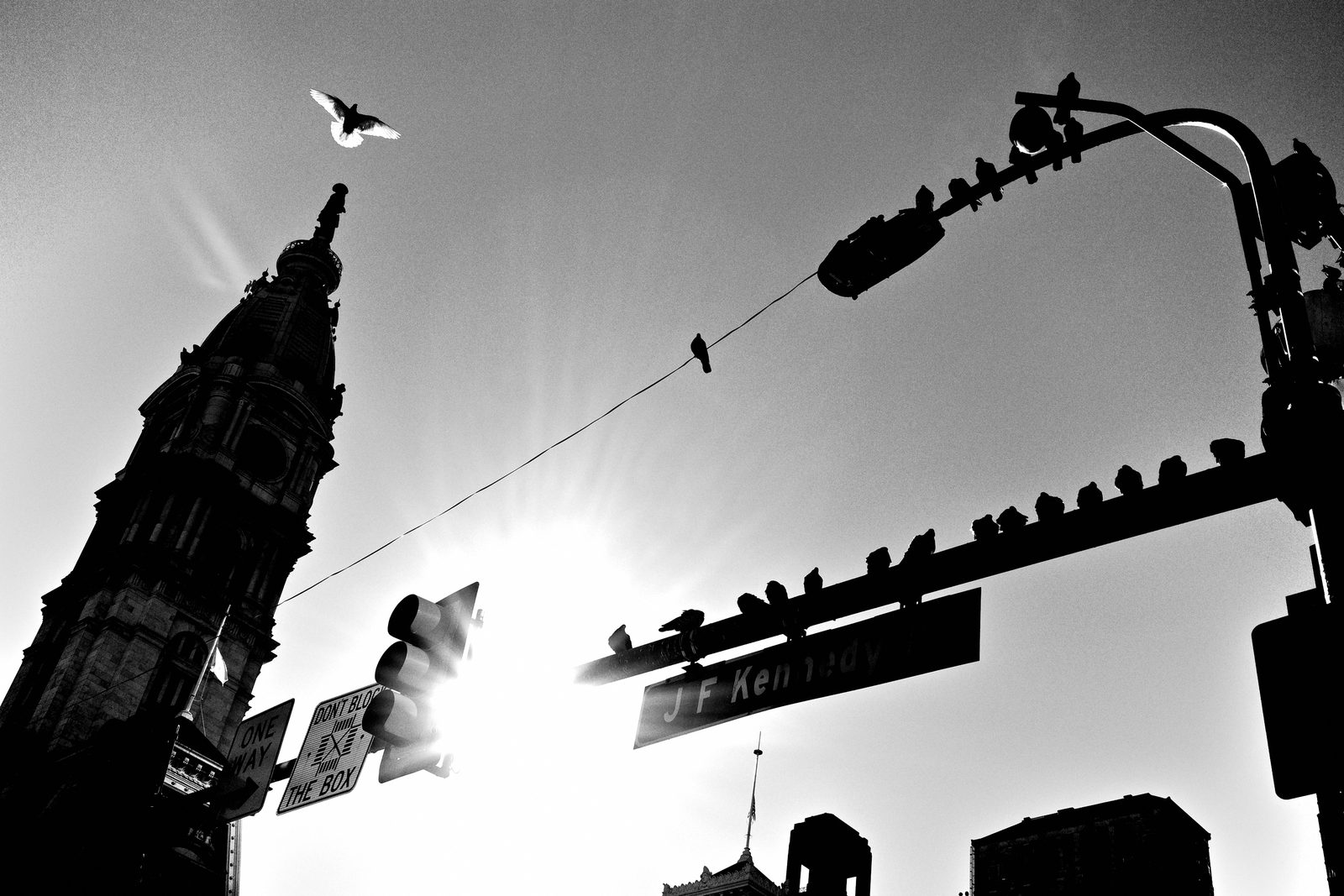
Biggest mistakes. First, the careless foreground — a careless foreground is one of the fastest ways to ruin a strong frame. If it doesn't create depth, anchor, or guide the eye, it's just noise. Second, letting layers overlap without separation, so the planes bleed into mush. And remember: when a foreground feels messy, it's usually a positioning problem, not a timing problem. Take one step. Lower the camera. Wait.
RELATIONSHIP TO PREVIOUS
Building on the Three Zones

This builds straight on Lesson 024, where we broke down foreground, middle ground, and background as the three spatial zones. There you learned to see the planes. Today we make the space between them felt — using light, scale, overlap, and position to turn three named zones into real, breathable depth.
RELATIONSHIP TO UPCOMING
Toward Light in Layers

We leaned on light hard today, and that's no accident. Next up is Lesson 026, Light in Layers, where we go all the way into using light as the foundation of separation — how it carves planes, builds contrast, and shapes the whole story. Today you used light to add depth; next you'll learn to build the layers with light first.
SUMMARY / TAKEAWAY
Reveal the Space

Last thing. Depth is never something you bolt on — it's something you reveal by separating the space that's already in front of you. Use light to pull the planes apart, scale and overlap to mark distance, one strong foreground to anchor, and your own body to make it click. Don't add more. Reveal the space — catch you next lesson.